Brand Identity
The mark, the map,
the mandate.
Everything Wildpath puts into the world — a badge, a photograph, a sentence, a lodge wall — answers to four words: travel the untamed beauty. This page is the system that holds those words accountable.
The Badge
A hexagon pressed from the desert floor.
The hexagonal seal holds the entire world Wildpath operates in. The sun sits low. Two acacia trees anchor the horizon. A giraffe and an elephant cross the frame. A trail of footprints tracks left to right, because every Wildpath route begins and ends on foot.
The badge never appears with text baked onto it in reproduction. The wordmark lives in the layout, not in the mark. The mark is the land. The layout is the language.
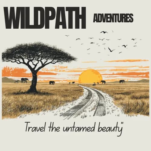
The Horizon Illustration
The founding scene, rendered in flat ink.
A lone acacia. A dirt road bending toward a low sun. Elephants crossing at the watermark. Birds heading somewhere warmer. This is the illustration that appears when the photograph cannot, and the only illustration the brand permits.
It is used as a divider, a background, a sign-off. It is never annotated, never recoloured, never cropped to remove the footprints. The footprints are the point.
Colour
Six tones pulled from the ground.
Cream is the pan clay. Forest ink is the basalt. Terracotta is the dune at 4 PM. No colour appears that does not exist within a day’s drive of Windhoek.
Cream
Primary background
Forest Ink
Primary text, dark sections
Ink Soft
Secondary dark surfaces
Terracotta
Accent, CTAs, highlights
Deep Terracotta
Section labels (WCAG AA)
Sand
Alternate section background
Typography
Two voices. One register.
Display — Fraunces
Untamed
A variable serif with optical sizing and a soft italic. Fraunces carries the headlines, the lodge names, the pull quotes. It is the voice of the landscape.
Body — Geist Sans
The route.
A clean grotesque for body copy, navigation, labels, and metadata. Geist handles the practical: durations, capacities, phone numbers. It is the voice of the guide.
Typographic Rules
Headlines use Fraunces italic light for emphasis words. Never bold italic.
Labels are Geist, uppercase, tracked at 0.2em, never larger than 0.7rem.
Body text never falls below 14px. Line height stays at 1.6 or above.
Voice
Four rules the copy obeys.
Locate, do not engineer
We do not manufacture experiences. We find them, then clear the path. The land is the author. We are the editors.
Sensory over superlative
Write what the boot feels, what the air smells like at dawn, what the silence sounds like. Avoid adjectives that could describe any hotel anywhere.
Temporary presence, permanent impact
Our guests leave. The lodges remain. The land remains. Every sentence should honour that asymmetry.
No slop
Forbidden words: revolutionize, unlock, seamless, next-generation, cutting-edge, boutique, curated, bespoke. If a travel brochure uses it, we do not.
Tonality
Where we sit on four axes.
Every piece of Wildpath copy can be tested against these dials. If a sentence pushes too far to either end, it is wrong.
Axis
Formal ↔ Direct
Position
Direct
Note
Short sentences. Active voice. The landscape does the work.
Axis
Warm ↔ Austere
Position
Austere with warmth
Note
Fire in the evenings, but no pillow chocolates. Comfort without cosseting.
Axis
Poetic ↔ Practical
Position
Poetic precision
Note
Metre matters, but every word must be literally true.
Axis
Exclusive ↔ Accessible
Position
Accessible seriousness
Note
Serious about the land, not about ourselves. No velvet ropes.
The Forbidden List
If a travel brochure uses it,
we do not.
These words are stricken from every Wildpath sentence. They mean nothing because they have been everywhere. We use specific nouns, active verbs, and the exact time of day.
The system is the standard.
Every page, photograph, and sentence on this site answers to the rules above. When in doubt, read the mandate.
Return to the map